為什麼是 IPython Notebook?
還記得第一次認識到 IPython Notebook 是在 Taipei.py 吧。 當時我還十分懷疑到底使用瀏覽器界面寫 Python 能有什麼好處。 尤其,這樣根本無法使用 Vim 的強大指令。 雖然有安裝並嘗試了一下,但最後還是沒有繼續使用 IPython Notebook。 不過 IPython interactive shell 倒確實是比原本的指令列好用許多,於是我慢慢也開始用它來取代原本的 Python 指令列了。
第二次遇到 IPython Notebook 則是在寫 CS231n 作業時。 在那堂課裡,每份作業都是用 IPython Notebook 來呈現。 同學可以在 Notebook 上及其他 Python 檔案裡編輯,並在 Notebook 裡直接驗證結果。 我這才發現這真的是一個跟別人分享與教學的強大方法。 尤其又有 nbviewer 可以用,簡直太方便了。 甚至不用安裝 Python 就能看到別人之前執行 Python 的結果。
後來對使用 Python 處理資料更有經驗後,更是體會到為何科學社群的人很喜歡 IPython Notebook 可能的原因了。其中一個重要原因一定是因為它可以極其方便的紀錄實驗步驟吧。
最近在資料科學領域學習,最讓我感覺震驚的不是技術,反而是 science != engineering 的感覺,跟寫 code 做產品完全不一樣的思維和工作模式。打開 ipython 或 rstudio 就像打開實驗記錄簿,不斷假設、驗證、預測。這跟做軟體工程,差別真的蠻大的。
— i͛ho͌ͯͦ̉͑we̍̃̏ͣr̆̽̓ (@ihower) August 31, 2015像是在做資料分析時,除了要管理程式碼以外,管理資料常常是更複雜的問題。 像是在做資料前處理或是特徵擷取時,經常會把資料做不同的轉換。 有時候會因為覺得某些轉換只會做一次,就沒有把轉換的步驟記錄下來。 但是如果未來想要更改某個轉換步驟,而要重跑實驗時,這種作法就會造成極大的麻煩。
另一方面,若是直接寫一個大程式,每次都從資料源頭進行各種轉換與分析。 則撰寫程式的時間會拉長,且如果資料量太大,也會使得每次執行程式都跑的太久。
這時就是 IPython Notebook 方便的地方了。它真的就是一個筆記本,讓你紀錄實驗過程。 本篇文章就是想好好分享一下 IPython Notebook,希望不要像我一樣錯過它了。 為了當作練習,本篇文章的程式碼也同樣用 IPython Notebook 呈現, 可以在 The First Tour of the IPython Notebook 直接閱讀。
在 IPython 裡做資料分析
於是就讓我們開始吧。我們將會用到以下程式庫:
其中,matplotlib 是一個非常實用的圖表工具。想當初也是朋友來問問題才發現它的存在。 想不到現在竟然也開始學習了。由於 IPython Notebook 可以直接顯示並存下它產生的圖,所以非常方便。
不過首先,要使用 %matplotlib inline
magic command 設定讓圖表直接顯示在筆記本上:
%matplotlib inline
找出最重要的特徵
通常要對模型有一些理解,找出權重最大的特徵可以有些幫助。所以我們用 polarity dataset 來示範這個概念:
wget http://www.cs.cornell.edu/people/pabo/movie-review-data/review_polarity.tar.gz
tar xzf review_polarity.tar.gz
然後,載入必要的套件:
import numpy as np
import matplotlib.pyplot as plt

from sklearn.datasets import load_files
from sklearn.feature_extraction.text import TfidfVectorizer
from sklearn.svm import LinearSVC
我們用 TfidfVectorizer 來得到每個句子的特徵向量:
sent_data = load_files('txt_sentoken')

tfidf_vec = TfidfVectorizer()

sent_X = tfidf_vec.fit_transform(sent_data.data)
sent_y = sent_data.target
最後再用 LinearSVC 訓練正負向的分類器:
lsvc = LinearSVC()
lsvc.fit(sent_X, sent_y)
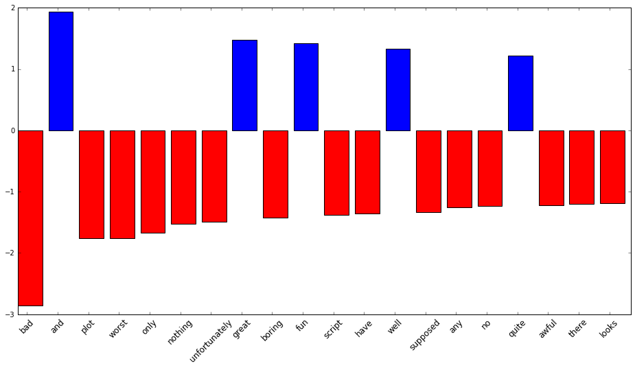
接下來就可以找出權重最重的特徵了:
def display_top_features(weights, names, top_n):
    top_features = sorted(zip(weights, names), key=lambda x: abs(x[0]), reverse=True)[:top_n]
    top_weights = [x[0] for x in top_features]
    top_names = [x[1] for x in top_features]

    fig, ax = plt.subplots(figsize=(16,8))
    ind = np.arange(top_n)
    bars = ax.bar(ind, top_weights, color='blue', edgecolor='black')
    for bar, w in zip(bars, top_weights):
        if w < 0:
            bar.set_facecolor('red')

    width = 0.30
    ax.set_xticks(ind + width)
    ax.set_xticklabels(top_names, rotation=45, fontsize=12)

    plt.show(fig)

display_top_features(lsvc.coef_[0], tfidf_vec.get_feature_names(), 20)
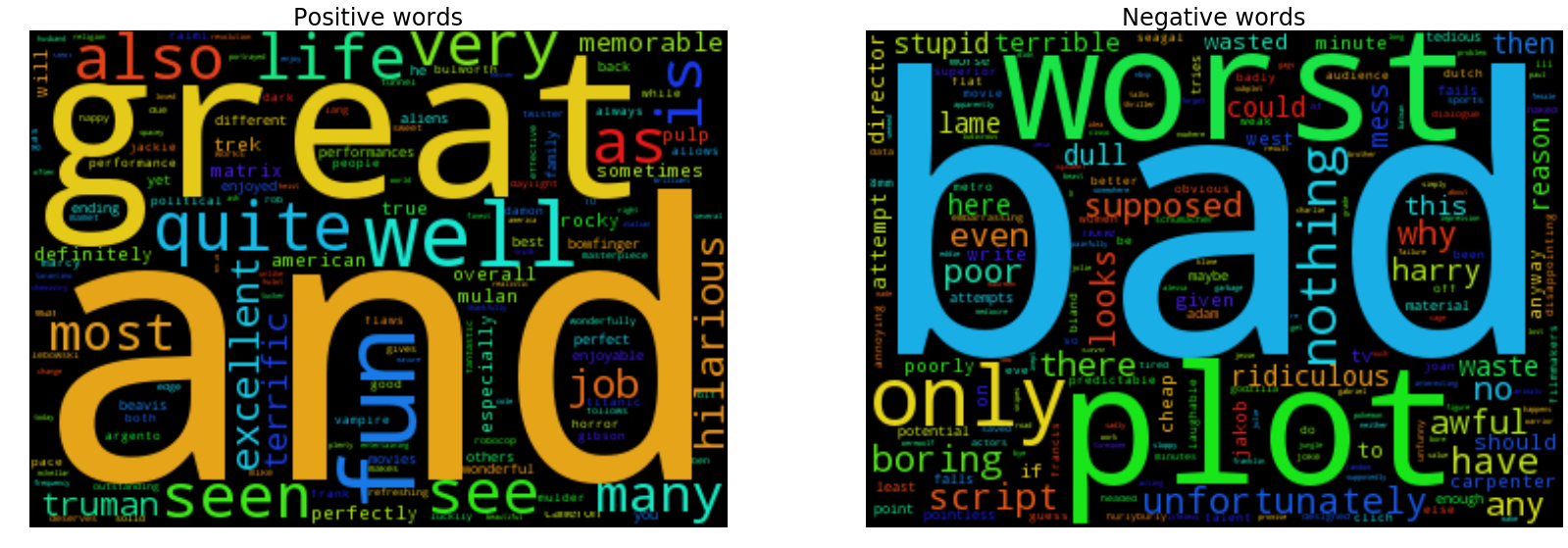
記得也曾在學長的論文上看過文字雲的呈現方式:
from wordcloud import WordCloud

def generate_word_cloud(weights, names):
    return WordCloud(width=350, height=250).generate_from_frequencies(zip(names, weights))

def display_word_cloud(weights, names):
    fig, ax = plt.subplots(1, 2, figsize=(28, 10))

    pos_weights = weights[weights > 0]
    pos_names = np.array(names)[weights > 0]

    neg_weights = np.abs(weights[weights < 0])
    neg_names = np.array(names)[weights < 0]

    lst = [('Positive', pos_weights, pos_names), ('Negative', neg_weights, neg_names)]

    for i, (label, weights, names) in enumerate(lst):
        wc = generate_word_cloud(weights, names)
        ax[i].imshow(wc)
        ax[i].set_axis_off()
        ax[i].set_title('{} words'.format(label), fontsize=24)

    plt.show(fig)

display_word_cloud(lsvc.coef_[0], tfidf_vec.get_feature_names())
用降維來做資料視覺化
通常太高維度的資料對我們來說不太易懂。所以也常使用降維的方式來做資料視覺化。 這裡我們會用 t-SNE 來視覺化 Iris flower data set。 同時,我們也用 MPLD3 來建立可以動態縮放的圖表。
from sklearn.datasets import load_iris
from sklearn.manifold import TSNE
import mpld3

iris = load_iris()

def display_iris(data):
    X_tsne = TSNE(n_components=2, perplexity=20, learning_rate=50).fit_transform(data.data)

    fig, ax = plt.subplots(1, 2, figsize=(10, 5))
    ax[0].scatter(X_tsne[:, 0], X_tsne[:, 1])
    ax[0].set_title('All instances', fontsize=14)
    ax[1].scatter(X_tsne[:, 0], X_tsne[:, 1], c=data.target)
    ax[1].set_title('All instances labeled with color', fontsize=14)

    return mpld3.display(fig)

display_iris(iris)
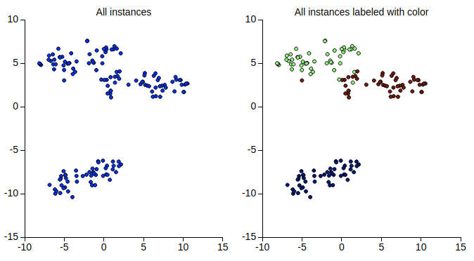
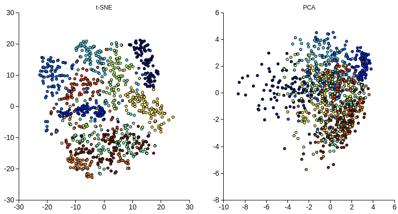
可以看到, 即使不知道資料的標記,t-SNE 還是能把不同種類的資料點分開的很好。我們再試試
MNIST dataset of handwritten digits 這個複雜一點的資料集。
同時也嘗試使用 PointLabelTooltip,好讓滑鼠移過時能顯示每個資料點的數字。
from sklearn.datasets import fetch_mldata
from sklearn.decomposition import PCA

mnist = fetch_mldata('MNIST original')

def display_mnist(data, n_samples):
    X, y = data.data / 255.0, data.target

    # downsample as the scikit-learn implementation of t-SNE is unable to handle too much data
    indices = np.arange(X.shape[0])
    np.random.shuffle(indices)
    X_train, y_train = X[indices[:n_samples]], y[indices[:n_samples]]


    X_tsne = TSNE(n_components=2, perplexity=30).fit_transform(X_train)
    X_pca = PCA(n_components=2).fit_transform(X_train)

    fig, ax = plt.subplots(1, 2, figsize=(12, 6))


    points = ax[0].scatter(X_tsne[:,0], X_tsne[:,1], c=y_train)
    tooltip = mpld3.plugins.PointLabelTooltip(points, labels=y_train.tolist())
    mpld3.plugins.connect(fig, tooltip)
    ax[0].set_title('t-SNE')

    points = ax[1].scatter(X_pca[:,0], X_pca[:,1], c=y_train)
    tooltip = mpld3.plugins.PointLabelTooltip(points, labels=y_train.tolist())
    mpld3.plugins.connect(fig, tooltip)
    ax[1].set_title('PCA')


    return mpld3.display(fig)

display_mnist(mnist, 1000)
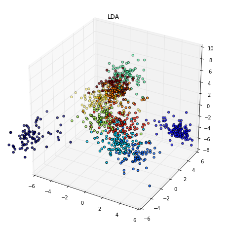
如果你想在有訓練資料的標記的情況下盡可能學到較好的投影向量的話,也可以試試 LDA。
from mpl_toolkits.mplot3d import Axes3D
from sklearn.lda import LDA

def display_mnist_3d(data, n_samples):
    X, y = data.data / 255.0, data.target

    # downsample as the scikit-learn implementation of t-SNE is unable to handle too much data
    indices = np.arange(X.shape[0])
    np.random.shuffle(indices)
    X_train, y_train = X[indices[:n_samples]], y[indices[:n_samples]]

    X_lda = LDA(n_components=3).fit_transform(X_train, y_train)


    fig, ax = plt.subplots(figsize=(10,10), subplot_kw={'projection':'3d'})

    points = ax.scatter(X_lda[:,0], X_lda[:,1], X_lda[:,2] , c=y_train)
    ax.set_title('LDA')
    ax.set_xlim((-6, 6))
    ax.set_ylim((-6, 6))


    plt.show(fig)

display_mnist_3d(mnist, 1000)
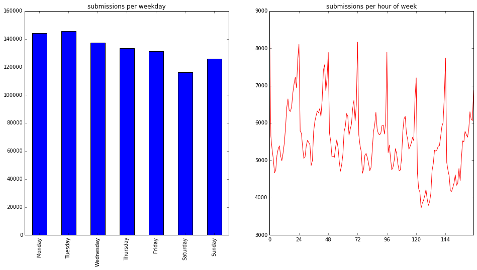
使用 Pandas 分析資料
Pandas 用來分析資料聽說也是非常方便。我們就用 Meta Kaggle 來看看 Kaggle 上的使用者都在做什麼吧。
import pandas as pd
import sqlite3
手動下載完資料並解壓縮後應該會看到一個 output 資料夾存放所有的檔案:
con = sqlite3.connect('output/database.sqlite')
kaggle_df = pd.read_sql_query('''
SELECT * FROM Submissions''', con)
先看看裡頭有什麼內容:
kaggle_df.head()
然後來試著分析上傳結果的時間分佈,先取得上傳時間在一週裡的日期或小時:
print('There is {} submissions'.format(kaggle_df.shape[0]))

# convert time strings to DatetimeIndex
kaggle_df['timestamp'] = pd.to_datetime(kaggle_df['DateSubmitted'])

print('The earliest and latest submissions are on {} and {}'.format(kaggle_df['timestamp'].min(), kaggle_df['timestamp'].max()))

kaggle_df['weekday'] = kaggle_df['timestamp'].dt.weekday
kaggle_df['weekhr'] = kaggle_df['weekday'] * 24 + kaggle_df['timestamp'].dt.hour

import calendar

def display_kaggle(df):
    fig, ax = plt.subplots(1, 2, figsize=(16, 8))

    ax[0].set_title('submissions per weekday')
    df['weekday'].value_counts().sort_index().rename_axis(lambda x: calendar.day_name[x]).plot.bar(ax=ax[0])

    ax[1].set_title('submissions per hour of week')
    ax[1].set_xticks(np.linspace(0, 24*7, 8))
    df['weekhr'].value_counts().sort_index().plot(color='red', ax=ax[1])
    plt.show(fig)

display_kaggle(kaggle_df)
然後我們試著把使用者分群,看看他們上傳時間的分佈是否有所不同。
from collections import defaultdict
from sklearn.cluster import KMeans

def display_hr(df, n_clusters):
    hrs_per_user = df[['SubmittedUserId', 'weekhr', 'Id']].groupby(['SubmittedUserId', 'weekhr']).count()
    total_per_user = hrs_per_user.sum(axis=0, level=0)
    user_patterns = (hrs_per_user / total_per_user)['Id']

    vectors = defaultdict(lambda: np.zeros(24*7))
    for (u, hr), r in user_patterns.items():
        vectors[u][hr] = r
    X_hr = np.array(list(vectors.values()))

    y = KMeans(n_clusters=n_clusters, random_state=3).fit_predict(X_hr)

    for i in range(n_clusters):
        fig, ax = plt.subplots(figsize=(6, 6))
        indices = y == i
        X = X_hr[indices]
        ax.plot(np.arange(24*7), X.mean(axis=0))
        ax.set_xticks(np.linspace(0, 24*7, 8))
        ax.set_xlim((0, 24*7))
        ax.set_title('Cluster #{}, n = {}'.format(i, len(X)), fontsize=14)
        plt.show(fig)

display_hr(kaggle_df, 9)
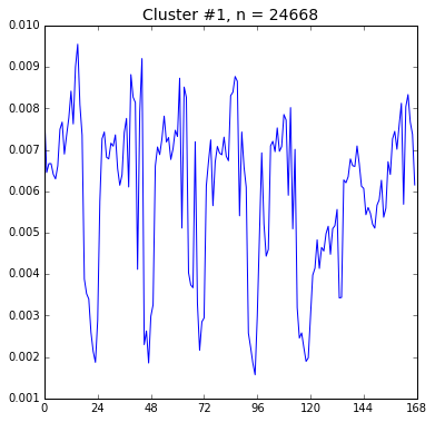
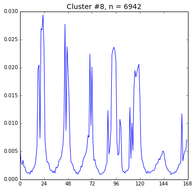
這裡我們只展示兩張圖,看起來第 1 群和第 8 群使用者似乎活動時間有點差別, 不知是否是時區不同的關係呢?
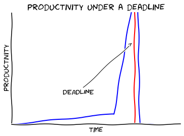
XKCD
最後我們用 XKCD 風格 來畫張圖吧。 為了能畫這張圖,我們得先安裝 Humor Sans 並且清除 matplotlib 的字型 cache。他的路徑可用以下指令找到:
import matplotlib
matplotlib.get_cachedir()
同時如果是 Python 3 的話,可能還需安裝額外的套件:
sudo apt-get install libffi-dev
pip3 install cairocffi
安裝完就可以開始畫了:
def xkcd():
    with plt.xkcd():
        fig, ax = plt.subplots()
        ax.spines['right'].set_color('none')
        ax.spines['top'].set_color('none')
        ax.set_xticks([])
        ax.set_yticks([])
        ax.set_ylim([-1, 10])

        data = np.zeros(100)
        data[:60] += np.linspace(-1, 0, 60)
        data[60:75] += np.arange(15)
        data[75:] -= np.ones(25)


        ax.annotate(
            'DEADLINE',
            xy=(71, 7), arrowprops=dict(arrowstyle='->'), xytext=(30, 2))

        ax.plot(data)
        ax.plot([72, 72], [-1, 15], 'k-', color='red')


        ax.set_xlabel('time')
        ax.set_ylabel('productivity')
        ax.set_title('productivity under a deadline')

        plt.show(fig)
xkcd()
結語
感覺還有好多需要學習的,目前也才剛剛起步。不過希望這篇文章有吸引到你想嘗試看看 IPython Notebook。最近也聽說 CS109 Data Science 似乎是個不錯的課程,如果想繼續練習或許可以試試看 0.0/
參考資料
- t-SNE in scikit learn
- feature engineering for Washington DC bikeshare kaggle competition with Python
- Turn Your Twitter Timeline into a Word Cloud Using Python
- Exploring Submission Timing